


The purpose of this article is to introduce top tips for building Boards in Pigment and to share best practices on Board design. 🎨
Table of contents
Types of Boards
There are three main types of Boards:
- Reporting Boards: These are the main outputs of the app and contain the information required for users to achieve the purpose of the model.
- Planning and Inputs: Where users will enter data that will be used in the planning process/calculations.
- Admin & Data: Boards for Administrators where they manage the model settings. Example contents, user access, data, data quality checks, model settings.
The type of Board should be considered when building Boards in Pigment. 👨🏻🏫
Top Tips for building Boards in Pigment
1. Consider your audience 
Designing with your end-users in mind is probably the most important factor that you have to consider. To be effective, you should put yourself in your end-users shoes and build the Board from their point of view. You should engage the users and ensure you have a full understanding of the information they need and what they want to do with that information.
Who is going to use the Board? What requirements do they have? What language and terms are they expecting to see? Are there any images and colors that can be used to bring familiarity to the end-user? These are all important considerations when designing a Board.
2. Consider the goal and story of the Board 🌎
Be clear on what you’re trying to achieve. All widgets should contribute to achieving the specific purpose of the Board. The widgets should be presented in a way that tells the story of the data.
3. Try a top down approach 🔽
Add a summary at the top of the Board, and detail at the bottom. Alternatively, you could have summary Boards that contain links to detailed Boards. If the subject changes as you go down the page, consider creating a second board (one for each subject).
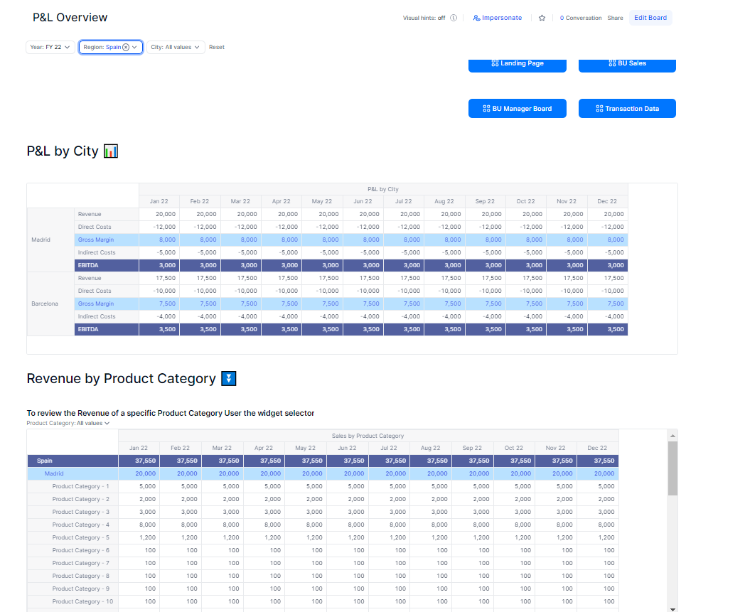
4. Consider dimensionality of each widget 📦
Dimensionality on a Board should be clear, consistent and intuitive. Widget Pages should adhere to the Board selectors unless they’ve been appropriately titled or have individual selectors available on the widget. You should consider hiding widget pages that are linked to the board.
An example of good practice is if you have a Cost Center as a Board selector, it is expected for most of the widgets on the Board to have Cost Center as a Page selector. Otherwise, it can be confusing for end-users if they are changing a Board selector and a widget's data isn’t updating. On the contary, if you have all widgets on a board dimensioned by Country, but, one widget had a City page, this should be a widget selector instead of a board selector in order to not mislead the user.
5. Keep it simple 🔠
Don’t overload users with an abundance of widgets and Dimensions. As mentioned earlier, each Board should have a specific purpose and all widgets on the page should contribute to that purpose. Cluttering the Board with information will only detract from what’s important. If groups of end-users have significantly different requirements, it might be easier to have separate Boards for each group. In addition, needlessly adding dozens of widgets can impact load times. A rough rule is you should have a maximum of 3 or 4 scrolls in board length (ideally less).
6. Include instructions or introductions, particularly on Boards that are complicated or require data entry ❗️
It’s best practice to have end user instructions on the boards that require action or an introduction to the board for users to know what the context. A user should be able to identify exactly what the board’s purpose is within a few seconds of opening.
Typically I like to provide an overview of the board, how to use and navigate the board, and step by step instructions for inputs on the board. Even better if you can include a link to process documentation of a instruction video. It can also be a good idea to use text widgets throughout the board or update widget titles to signpost certain functionality. This will reduce the number of mistakes and questions that arise.
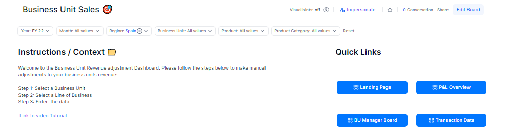
7. Consider building a Landing Board 🛬
Landing Boards help provide the user with context for the application and provides the best end-user experience for navigation. In complex applications landing boards by profile can help users with a more personalised experience, allowing them to navigate to the key dashboards that’s important for their role.
8. Utilise Page Options 🔠
You have several Page Options than can help you create a seamless end user experience.
- Order selectors: Consider an order that is logical such as parent hierarchies on the left and child dimensions on the right. Consistent ordering across the boards.
- Hide selectors: hide the selectors that don’t need to be interacted with and only introduce unwanted noise. In some circumstances it can make sense to only show on widgets the selectors that are different to the ones on the board.
- Minimize selectors: Which selectors are useful, but rarely interacted with.
- Unlink relevant selectors: For example You have a P&L board by City, Month and P&L Line. In this board you also have one widget that has a breakdown of Revenue by “Product Category”. The rest of the P&L isn’t dimensioned by Product Category. It would be misleading to have a Board selector by “Product Category” as it would confuse end users as it would only update one widget. In this circumstance, it would make sense to unlink the “Product Category” dimension and only display it on the appropriate widget.
9. Leverage Application Variables to sustainably change default items on multiple boards 🚴🏽♂️
A common usage would be to to have a Application Variable for ‘Current Month’, ‘Current Year’ or ‘Current Version’. Each month you can change the variable, which would update all dashboards at once instead of manually maintaining each dashboard. This gives us maintenance benefits as well as user experience benefits (As end users will reliably be looking at the relevant data, instead of relying on them to change the board selectors).
10. Choose relevant widgets 📊
Choosing the right widgets can be key when creating a Board. This could be using bar charts to compare items in the same category, using line charts when you want to show how a pattern changes across a time/Dimension or just using the correct KPIs that align with the purpose of the Board. Designing a Board with suitable widgets can greatly improve how information is communicated.
11. Provide context to key figures and Important deviations ✅
How will users know if the numbers are meaningful? Can you highlight areas that require action? It is important to signpost key information and analysis on Boards. It’s also important to appropriately name all widgets, units and axes. Where possible you should provide comparison values. You can also use colors to bring attention to key figures or actions. Another consideration is adding areas for super users or end users to add commentary.
12. Be consistent 📐
Consider using consistent language, color schemes, layouts, selector order and visualization. It will allow information to be digested easier and the users will have a standardized layout that can be anticipated when they open a Board.
13. Round your numbers 🔟
This adds clarity to data, allows users to absorb the information at a glance and reduces the chance of a mistake. You should also be consistent with your rounding.
14. Include links to relevant or frequently user boards 🔗
To help users navigate to the related areas. Utilise buttons !
15. Obtain regular feedback 📣
Whether you're in the design, implementation or production stage, it’s important to obtain regular feedback from end-users. Designing Boards should be an iterative process, you should ask the team questions like:
- What widgets are most useful and why?
- What widgets are least useful and why?
- What’s missing and should be included?
Here are some example Boards by Use Case. You can use these as inspiration for your own designs.
Are there any top tips that I’ve missed? Have any questions? Let me know in the comments below.