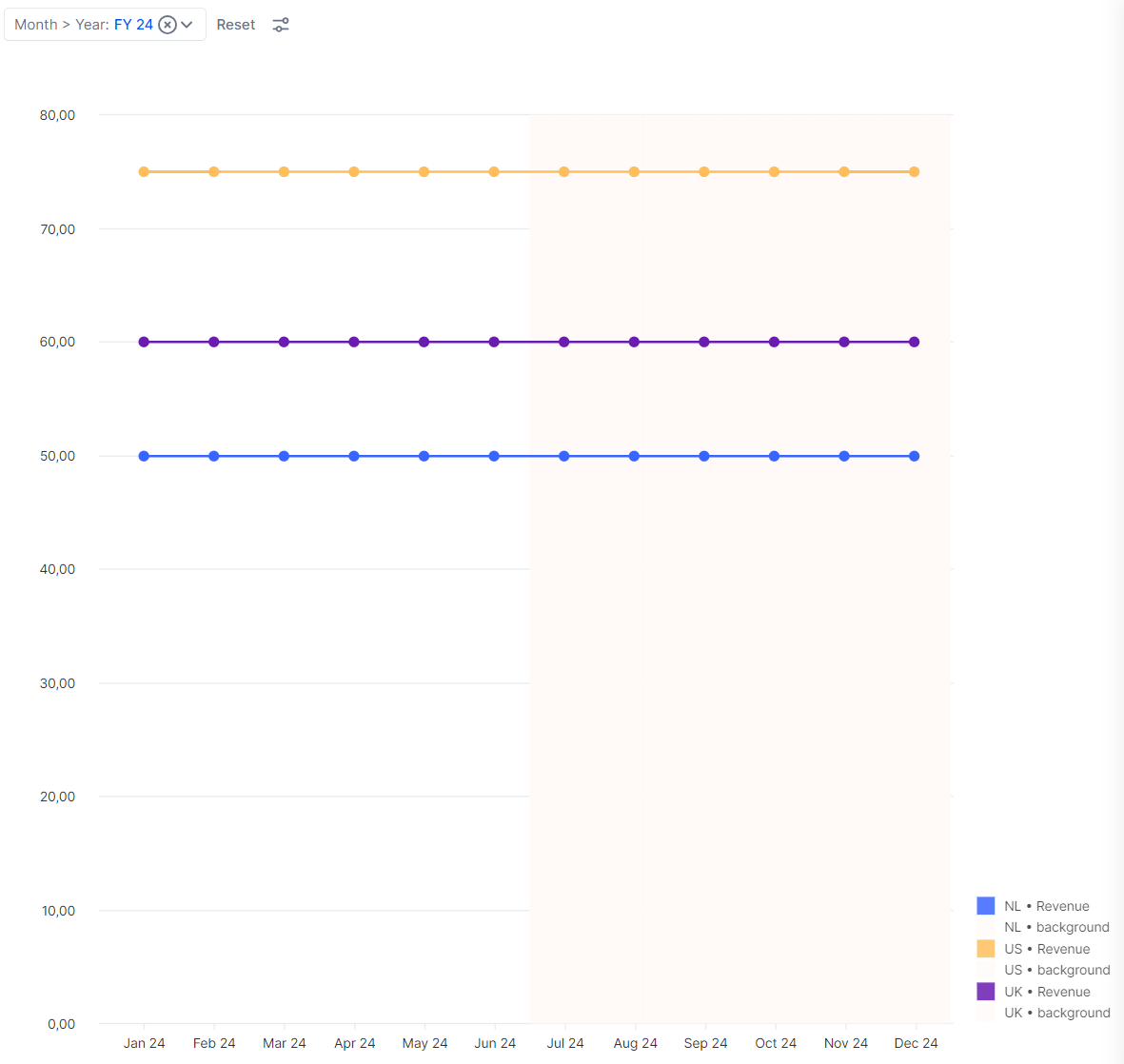


When you’re making the most amazing charts in Pigment sometimes you want to make them even better! In this short article, we’ll explain how to display a forecast period in your graph with a transparent background color. Example below:
Key conditions before you start:
-
Your chart must be based on a Table.
-
Your chart type will be a combination chart.
-
Add one or more metrics that you want to show in your graph to your Table. (we took a Revenue metric in this example)
-
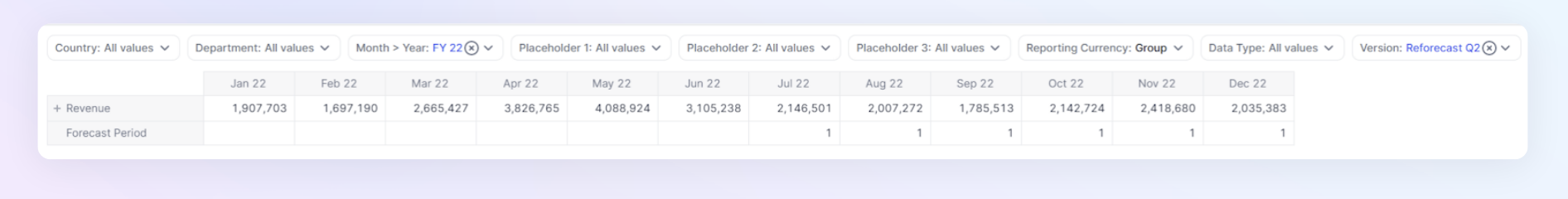
Create and add a metric that marks your forecast period with a number (e.g. 1). You can do this by writing a simple IF statement based on your switchover period:
-
Example: IF(Version Switchover >= Current Month,1,BLANK)
-
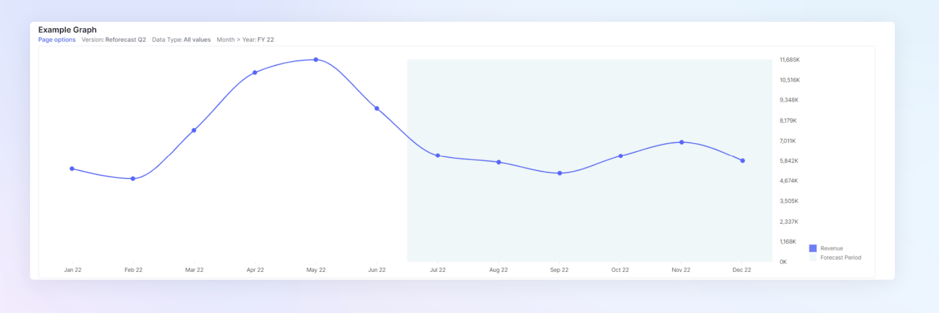
Step 1: Create a view in your Table that will match the outcome of your graph like the example below where we show the year 2022 and June 2022 is our last Actual month.
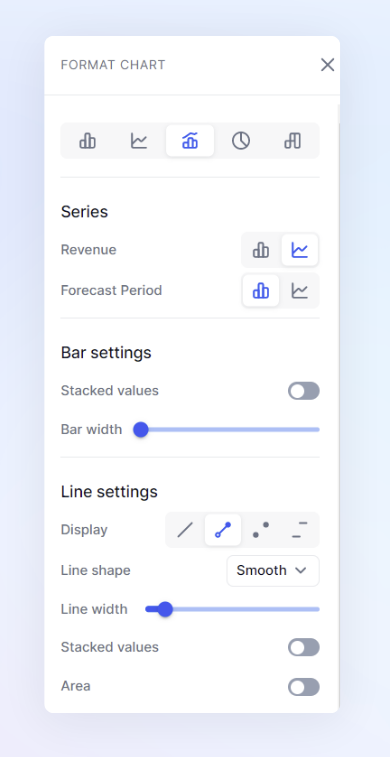
Step 2: Turn this grid into a chart and select the following settings:
-
Chart type: Combination
-
Normal metrics on line
-
Your “Forecast Period” metric on bars
-
Bar width = maximum (toggle to the left)
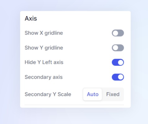
Step 3: Scroll down to the “Axis” section and set:
-
Hide Y Left axis
-
Secondary Axis
-
Optional: turn Gridlines on or off
Step 4: Now all that’s left to do is to pick a nice transparent color for your bar chart and publish the view to a board to amaze your users!

Tip: if you prefer to mark the background of your Actual periods, just flip the logic of your metric that marks the forecast periods!