


Any Metric or Table View can be displayed as a chart in Pigment. In this article, you will find examples of charts and chart configuration options.
Table of Contents
Accessing Chart Display Mode
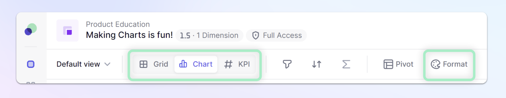
Use the menu on the top left of a Metric of Table view to switch to Chart Display Mode. This will give you the option to see how a chart would look under its current configuration. You can use the Pivot functionality to change where dimensions are located on the different axis. Click Format to be able to make adjustments to the chart you will use and the options for each chart.
Accessing Chart Options
| Once switching to Chart mode and Selecting Formatting, the side panel will appear. This is where you configure all visual aspects of the chart. Pigment currently offers 5 different chart types: Bar, Line, Pie, Combined and Waterfall. You can toggle back between the different chart options and you’ll notice the options are different for each chart. | 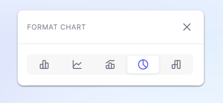
|
Caveat
Please note that switching from series to X-axis and Pages, is done by using the Pivot panel as you would do in grids. When the view is switched to Chart mode, all Filters, Sort, and Totals configurations are kept. Filters and Sort option will affect the Chart which is displayed, but Totals won't be displayed in the Chart.
Chart specific settings
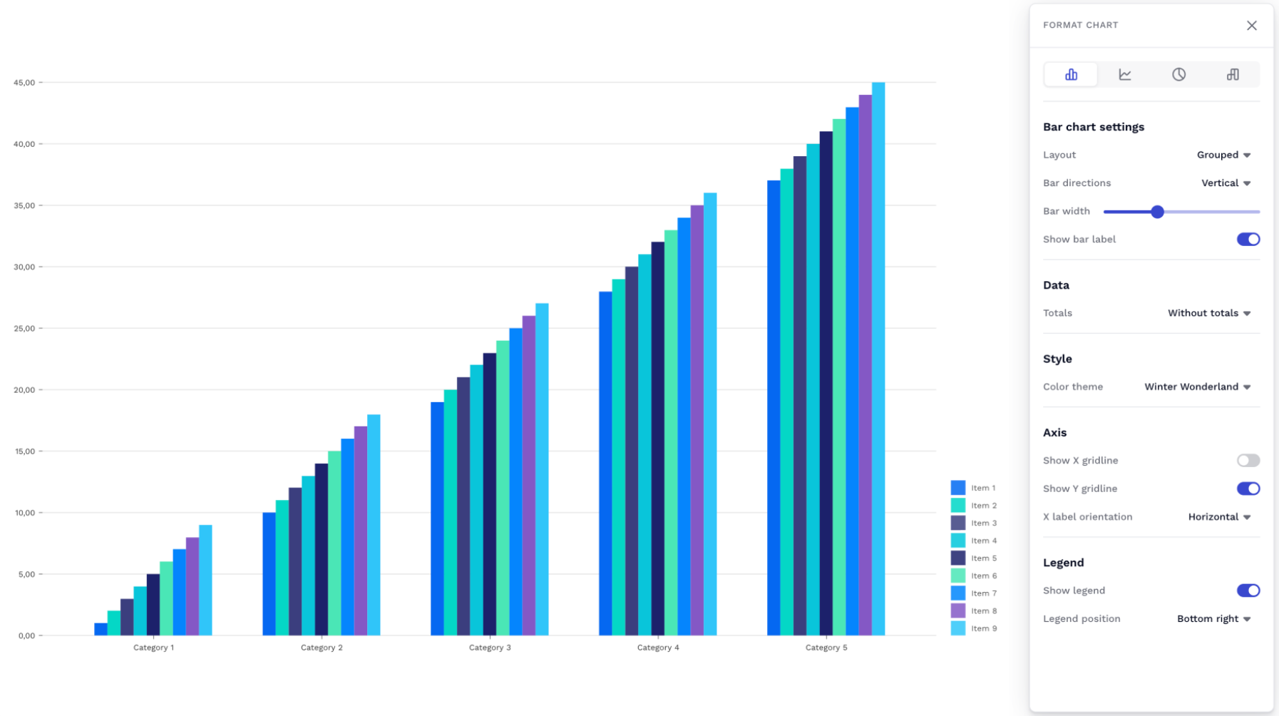
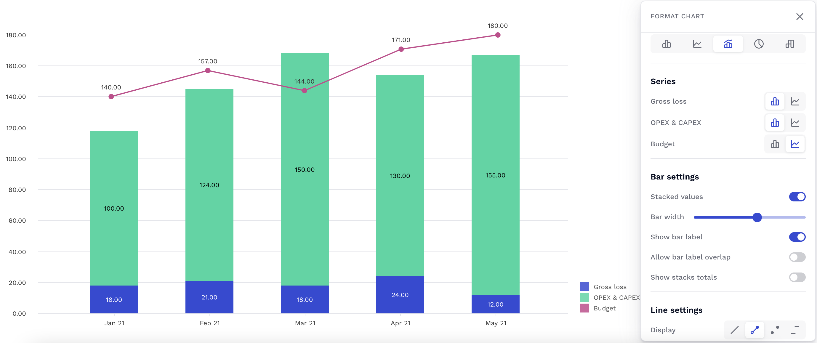
Bar Chart
Bar charts are useful for showing comparisons between categories of data or comparing changes for multiple groups over the same period of time.
| Setting | Description | Options |
| Layout | The Layout setting configures how series are clustered visually on a chart. | Grouped : Series are clustered side-by-side.
Stacked : Series values are added on the Y-axis, so each consecutive series appears above the last one. Make sure the units of all series match. |
| Direction | The Direction setting configures the bar direction.
| Vertical: bars of each series will be displayed vertically.
Horizontal: bars of each series will be displayed horizontally. |
| Color Theme | The Color Theme option configures different presets of colors to represent each series. | Currently, Pigment support 8 presets (Pigment, Rainbow Spectrum, Copenhagen Facades, Sunset Boulevard, Winter Wonderland, Utility, Moreno Glacier, Autumn in New York). |
| X gridline and Y gridline | The X gridline and Y gridline options enable the appearance of gridlines extending from the X and Y-axis. | Toggle on/off (on by default) |
| Bar Label | The Bar Label setting shows/hides the label inside each bar displaying the value of the bar. | Toggle on/off (on by default) |
| X label orientation | The X label orientation setting configures the orientation of the X-axis labels. To avoid label overlap, use the diagonal or vertical option. | Horizontal, vertical or diagonal |
| Legend | The Legend setting shows/hides the Legend of the chart series. Use this option to display or hide the legend. | Toggle on/off (on by default) |
| Legend Position | The Legend Position setting configures the position of the legend. | The legend can be set to 4 different positions: Botton right, Top right, Bottom center, Top center. (Bottom right by default) |
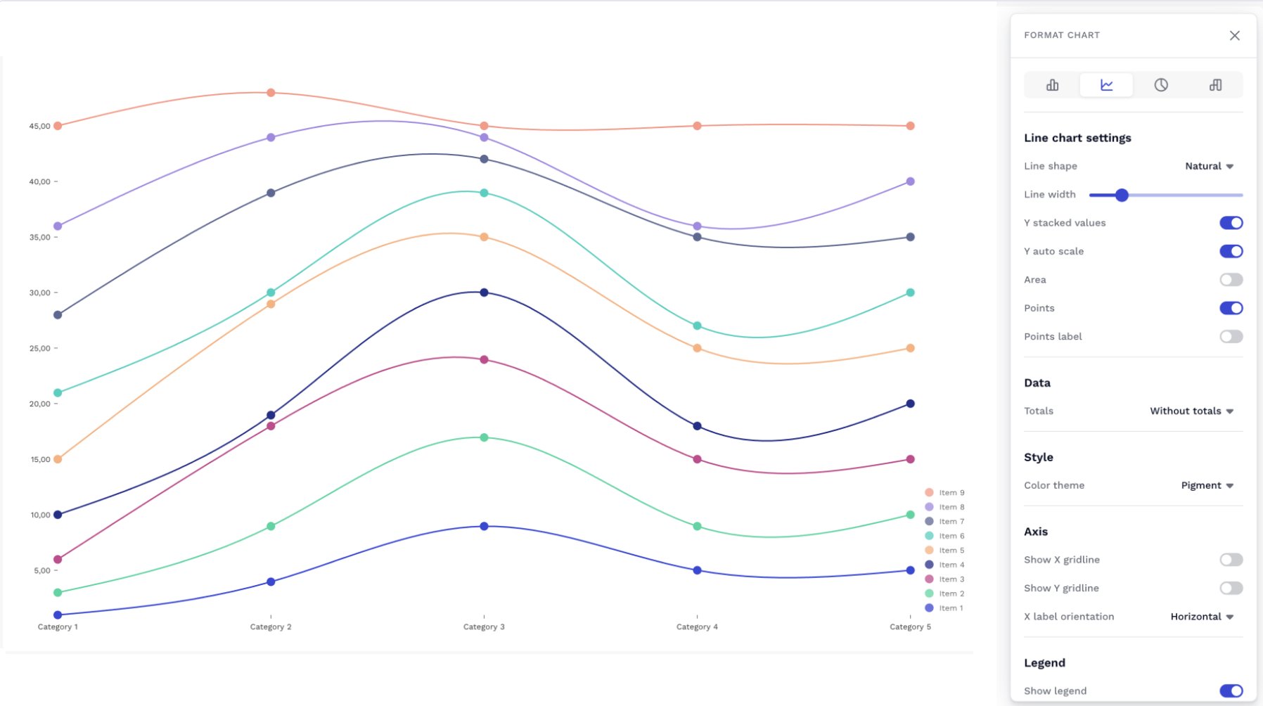
Line Chart
Setting | Description | Options |
| Line Shape | The Line Shape setting configures the shape of the curve which connect or interpolate the series data points. | Linear: Displays straight line segments connecting points
Natural: Displays smooth curve connecting points
Basis: Displays smooth curve interpolating points |
| Line width | The Line width setting configures the width of the curve.
| Slider from 0 to 10 (2 by default, use 0 to hide the curve) |
| Y stacked values | The Y stacked values setting configures the position of each series. If the Y Staked Value option is enabled, Series values are added on the Y-axis, so each consecutive series appears above the last. Note: Make sure units of all series match. | Toggle on/off (off by default) |
| Area | The Area setting fills the area under each curve. | Toggle on/off (off by default) |
| Color Theme | The Color Theme option configures different presets of colors to represent each series. | Currently, Pigment support 8 presets (Pigment, Rainbow Spectrum, Copenhagen Facades, Sunset Boulevard, Winter Wonderland, Utility, Moreno Glacier, Autumn in New York). |
| Show X gridline Show Y gridline | The Show gridline options will allow you toggle on and off the gridlines that are shown in the background of the chart. | Toggle on/off (on by default for Y and off for X) |
| Y Scale | This option allows you to control the size of your Y axis. | Auto - will automatically scale Y axis based upon the max and min value from your grid. Fixed - allows for a manual input of the Max and Min values shown on the Y axis. |
| Include 0 | When in Auto Y Scale mode, this option will resize the scale to include 0 as either the min or max value. | Toggle on/off (off by default) |
| Point | The Point option configures how data points appear on the chart. Disable that option to hide data points. | Toggle on/off (on by default) |
| Point labels | The Point labels option toggles the appearance of value labels for each data point on a chart. | Toggle on/off (off by default) |
| X gridline and Y gridline | The X gridline and Y gridline options enable the appearance of gridlines extending from the X and Y-axis. | Toggle on/off (on by default) |
| X Label orientation | The X Label orientation setting configures the orientation of the X-axis labels. To avoid label overlap, use the diagonal or vertical option. | Horizontal, vertical or diagonal |
| Legend | The Legend setting shows/hides the Legend of the chart series. Use this option to display or hide the legend. | Toggle on/off (on by default) |
| Legend Position | The Legend Position setting configures the position of the legend. | The legend can be set to 4 different positions: Botton right, Top right, Bottom center, Top center. (Bottom right by default) |
Combined Chart
| Setting | Description | Options |
| Series | Use Series to configure which items should be displayed as bars or lines. Items available in Series are the ones displayed as Rows in the Configure Panel. | Bars |
| Stacked values | The Stacked values setting configures how series are clustered visually on a chart. | Toggle on : Series are clustered side-by-side. Toggle off : Series values are added on the Y-axis, so each consecutive series appears above the last one. Make sure units of all series match. |
| Show Label | The Bar/Line Label setting shows/hides the label inside each bar/line displaying the value of the bar/line. | Toggle on/off (on by default) |
| Line Settings Display | The Display settings configures how line items are visualised. | Line without dots |
| Secondary axis | The Secondary axis option allow you to plot line items on a secondary axis | Toggle on/off (off by default) |
| Color Theme | The Color Theme option configures different preset of colors to represent each series. | Currently, Pigment support 8 presets (Pigment, Rainbow Spectrum, Copenhagen Facades, Sunset Boulevard, Winter Wonderland, Utility, Moreno Glacier, Autumn in New York). |
| X gridline and Y gridline | The X gridline and Y gridline options enable the appearance of gridlines extending from the X and Y-axis. | Toggle on/off (on by default) |
| X label orientation | The X label orientation setting configures the orientation of the X-axis labels. To avoid label overlap, use the diagonal or vertical option. | Horizontal, vertical or diagonal |
| Legend | The Legend setting shows/hides the Legend of the chart series. Use this option to display or hide the legend. | Toggle on/off (on by default) |
| Legend Position | The Legend Position setting configures the position of the legend. | The legend can be set to 4 different positions: Botton right, Top right, Bottom center, Top center. (Bottom right by default) |
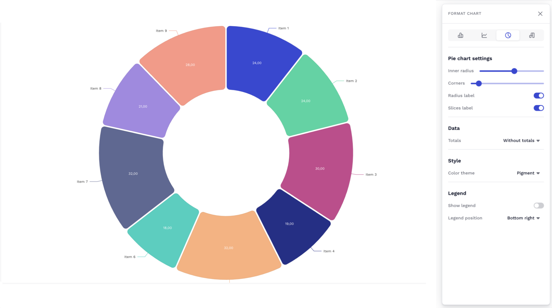
Pie Chart
| Setting | Description | Options |
| Inner Radius | The Inner Radius option configures the radius for the "donut hole". | Slider 0 to 95 (50 by default, by setting this option to 0, the chart will be displayed as a Pie chart instead of a donut) |
| Color Theme | The Color Theme option configures different preset of colors to represent each series. | Currently, Pigment support 8 presets (Pigment, Rainbow Spectrum, Copenhagen Facades, Sunset Boulevard, Winter Wonderland, Utility, Moreno Glacier, Autumn in New York). |
| Radius Label | The Radius Label option toggles the appearance of labels outside of each slice displaying the series name. | Toggle on/off (on by default) |
| Slices Label | The Slices Label option toggles the appearance of a label inside each slice displaying the value of the slice. | Toggle on/off (on by default) |
| Corners | The Corners option configures the corner radius of each slice of the pie chart. | Slider 0 to 100 (0 by default) |
| Legend | The Legend setting shows/hides the Legend of the chart series. Use this option to display or hide the legend. | Toggle on/off (on by default) |
| Legend Position | The Legend Position setting configures the position of the legend. | The legend can be set to 4 different positions: Botton right, Top right, Bottom center, Top center. (Bottom right by default) |
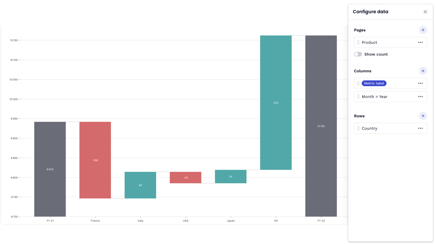
Waterfall Chart
| Setting | Description | Options |
| Padding | The padding allows you to play with the spacing between bars |
From 0 to 0.9 |
| Auto scaling | By default, Y-axis starts at 0. If activated, the scale will be inferred from the underlying data. | Toggle on/off (on by default) |
| Connecting lines | The connecting lines option allows you to add dashed lines between the bars | Toggle on/off (on by default) |
| Hide zeros | The hide zeros toggle allows you to hide the bars with a value of 0. | Toggle on/off (on by default) |
| X Label orientation | The X label orientation setting configures the orientation of the X-axis labels. To avoid label overlap, use the diagonal or vertical option | Horizontal, vertical or diagonal |
| Step color | Choose the color of your step | Color picker (grey by default) |
| Ascending values color | Choose the color of your ascending values | Color picker (green by default) |
| Descending values color | Choose the color of your descending values | Color picker (red by default) |
For more information on waterfall charts, check out this article dedicated to them!
See also: