


Action widgets are a great way to add navigation, imports into Blocks, and external links to any Board in an easily accessible format. This article discusses how to implement this functionality.
Table of Contents
How can you use Action widgets?
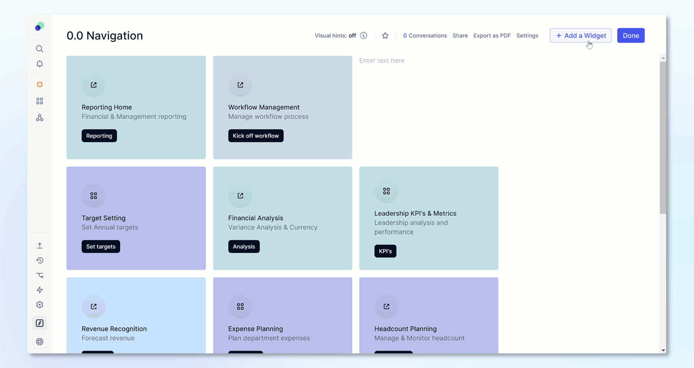
Actions are a type of widget that can be added to a Board to help end users easily perform certain tasks. There are three different use types of actions; they can be used for navigation between Boards, importing into Blocks, or adding a link to an external website. They can be visually customized by using different types of action widgets, cards and buttons.
The Configure Boards permission is required to be able to set up an action widget.
Action on clicks
There are three different actions that can be performed when a Member clicks on an action widget. These actions will be dependent on their security setup.
For example, if a Member does not the Import Data permission, they will not be able to perform an import. They will also not be able to see Boards they do not have access to.
Go to another board
This action can be used to allow users to easily navigate to other boards by selecting the button. When selecting this action, just select the Board that you want them to navigate to after clicking. If they do not have access to the Board, the button will be grayed out for them with a message letting them know they don't have permission to navigate to that Board.
Open external link
This option allows for an external website link to be opened in a new window.
Trigger an Import
You can add a saved import configuration that will be triggered when a user clicks on the button. When you the Import option, you will be prompted to choose the Block and configuration for the import you want to run.
You must first choose the Block that you wish to import into. Using the dropdown, you will see a list of all Blocks that have a saved import configuration associated with them.
The next option is to choose the exact import configuration. This option works with connectors and file imports. If you do use a file import, when the user clicks on the button, they will need to provide the appropriate file to be able to complete the import.
Display options for Action widgets
When setting up an Action widget, there are two different display types, Card and buttons. Cards allow you to give a bit more context through the description field and more flexible options on Orientation and alignment. Buttons allow for a sleeker presentation and take up less space.
Card display options
When initially adding a Action widget you will see options for Card title, description and button label. After adding an Action widget, you can click on the settings icon and get more formatting options.
Title: This is the bold text that appears at the top of the card. It usually provides a brief headline or title for the action.
Description: The description is plain text that appears below the title. It provides additional information or context for the action.
Button Label: This controls the text that appears on the button within the card. The button is often used to trigger the action. However, if you click anywhere on the card, the action will launch.
Orientation: There are two options: horizontal and vertical. This choice determines the order of elements within the card, such as the icon, title, description, and button. In vertical orientation, they are stacked, while in horizontal orientation, they are arranged from left to right.
Alignment (Vertical Orientation Only): When using the vertical orientation, you can adjust the alignment of the icon, title, description, and button. You can choose between left justification or centering.
Background Color: By default, action cards have a white background. You can enable a background color and customize it. When a background color is applied, the text and button color will automatically adjust to provide better visibility, ensuring there's enough contrast.
Card Background Color / Button Color: The name of this option changes depending on whether you've enabled a background color. If a background color is enabled, you can choose the color for the entire card. If not, you can adjust the color of the button. Note that you can't choose both the card background color and the button color simultaneously.
Icon
There are different icons depending on the Action on click that you choose. When the Go to another board action is used, the icon displayed will be the one assigned to the Board.
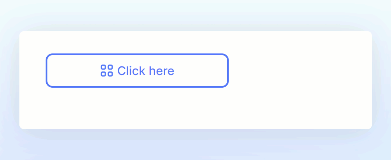
Button display options
You can customize the look of a button and adjust the Action through the Action widget settings.
- Navigate to the Board the button is located on.
- Click Edit Board.
- Hover over the button and click on the Settings icon.
Button label and tooltip
The button label controls what text will appear on the button, by default it will say Go to Board, Click here or Start an Import. There is no limit on the text of the label, however, buttons are limited to one line so its best to choose a small title.
You can add a tooltip that will appear when users hover their mouse over a button. This tooltip is limited to 150 characters.
Formatting Options
Filled will use a solid color vs Outlined which will show a transparent background and allow you to choose the outline of the button. Depending on the option you choose, the color pickers icon will adjust as will the colors selected. You can choose the color of the button or outline and the text. You can also bold or italicize the button's label.
Display Icon
This toggle will control if the icon appears on the button, there are different icons depending on the Action on click that you choose. When the Go to another board action is used, the icon displayed will be the one assigned to the Board.
Fit to text
This option determines the size of your button. If toggled off, the button size will be determined by the overall size of the widget. If you choose this option, you can resize the widget and the button will adjust to fit the entire widget. To adjust the widget size, you have to have the button settings closed, but the Board must still be editable. Then just drag and drop.
If this option is toggled on, the button size will be determined by the length of the text within the button. You will also get an additional option of the Button alignment, which determines where the button will appear, in relation to the entire size of the widget. If you have a large widget, and the text is small, you can determine if you want the button to appear on the right or left sides, as well as an option for the middle.
How to add an Action widget to a Board
Users with the Configure Boards permission can add a button to a Board through the following steps.
- Click the Edit Board button on the Board to which you want to add a button.
- Click + Add a Widget and select Action.
- Select an Action on click and fill in the corresponding Board, link, or import configuration.
- Select the Type of Card or Button.
- Fill out the text fields that control the wording on your action widget.
- Click Add and the button will appear in the top left of the Board.