


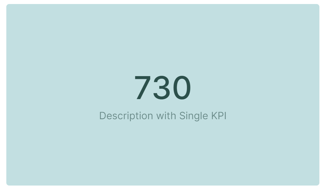
Key Performance Indicators (KPIs) are performance measurements used to highlight key data. The KPI widget allows you to easily display these in Boards. Each KPI is a single numeric value in a formatted text and complemented with a small description.
Table of Contents
How do you create a KPI view?
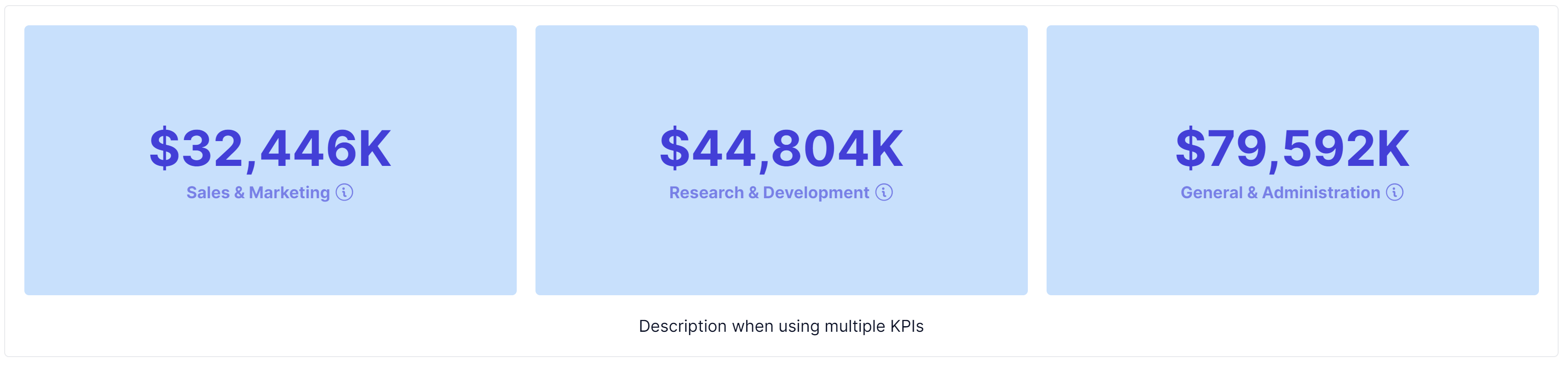
You can create single KPIs with one value, or create multiple KPIs and display up to 36 KPIs at once. These can be from a Table with multiple Metrics or from an individual Metric. In order to successfully display a KPI you have to create a KPI view. If you have multiple KPI values, you can also display them as a trend line.
KPIs are compatible with the following data types: Number, Integer, Date, and Text.
Single KPI shortcut
| When creating a single KPI, there’s a shortcut that you can use. Right-click on any cell of the grid and click Create KPI View. All Dimensions in Columns/Rows are automatically moved to Pages with the relevant items already selected in the page selector. | 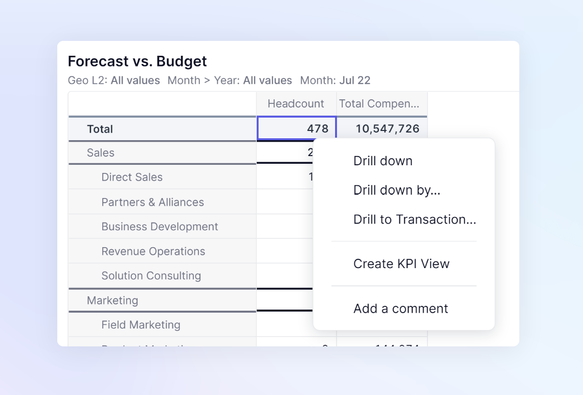 |
Setting up a KPI View
When setting up a View for KPIs, the data points displayed in columns are the ones that are displayed as KPIs. Use the pivot and filter features to set up your View. If you’ve multiple rows of data, the View won’t be compatible and you’ll need to pivot Dimensions to the Pages or Columns to create a KPI.
You can have more than 36 KPI cards in your columns. However, only a maximum of 36 display at any time. For example, if you have 48 months of data set in columns, only 36 will be shown at a time. You can use a year grouping Dimension to specify which 36 months. You can display up to 36 trend lines if you’ve activated that option.
When you’ve created your KPI-compatible view you can add it to a Board by setting the display tip to KPI, and then using the Add to Board option.
Display KPI values as trend lines
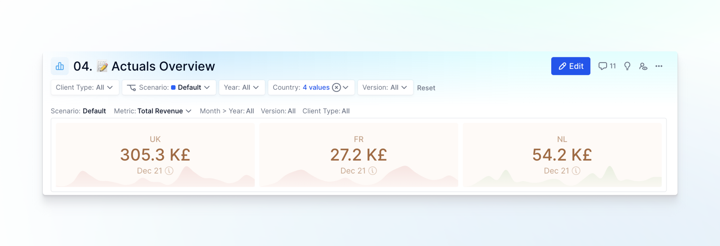
When you choose to display your KPI values as trend lines, the number of trend lines displayed is the same as the items in the second header in your View. The main KPI figure displayed for each card will correspond to the last cell of each trend. Trend lines will only be displayed if there’s more than one cell value available for a specific card.
For example, let’s say that your View configuration has the columns Month and Quarter, which is then categorized into a second column header for Month. Your KPI trend lines display one trend for each quarter, and each trend line has 3 data points, one for each month. On Tables, you can also display one trend line for each metric.
The figure displayed in the main KPI card is the value in the last cell of each trend. The card retains the same background and text color as the last cell as well.
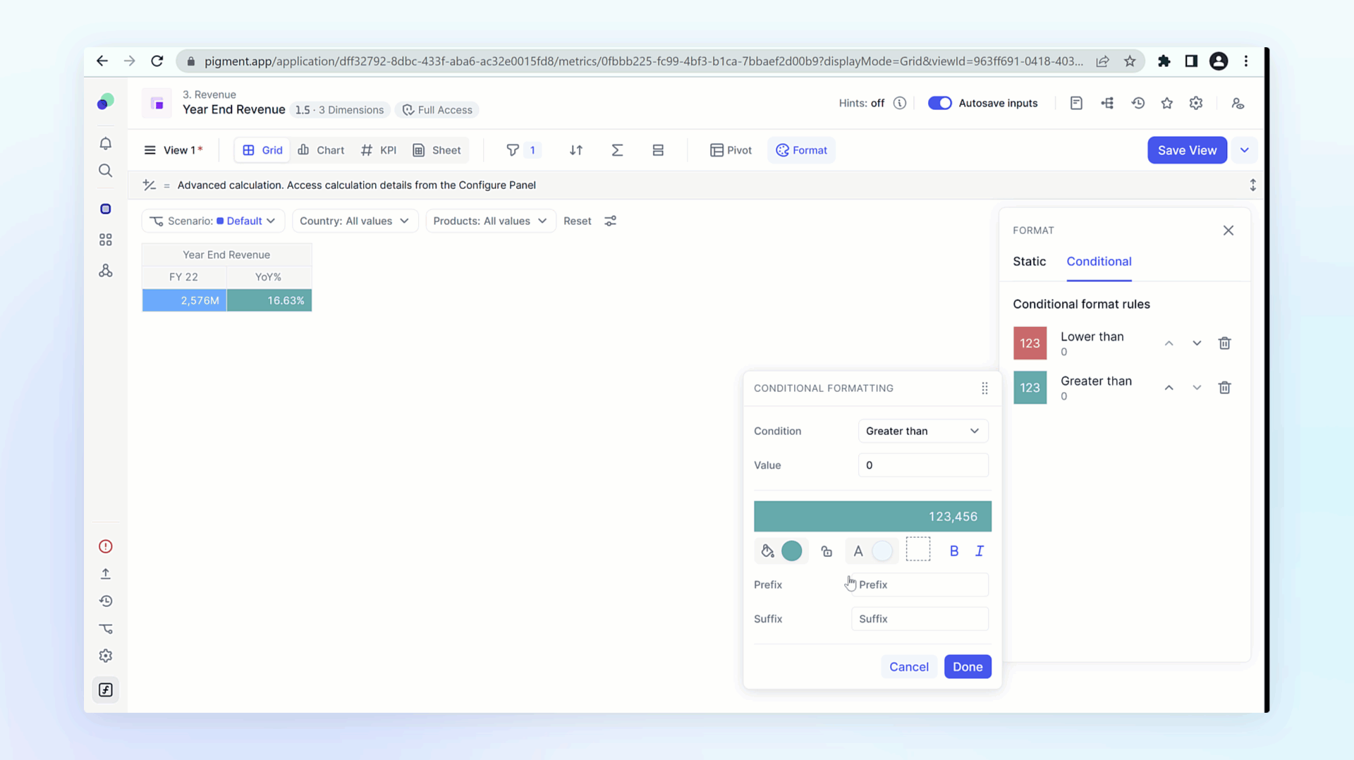
- In your KPI View, click Format.
- Toggle on Show multiple values as a trend.
- (Optional) If want to format the look of your trend lines, do the following:
a. Toggle on Color trend according to its direction.
b. From the color palettes, select the colors you want for each trend line direction.
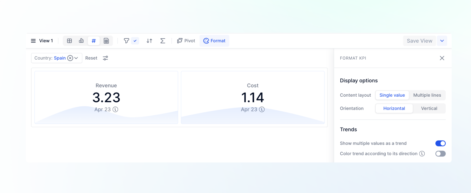
Configuring KPI Values as Trend Lines - (Optional) If you don’t want to display empty cells, select Hide empty columns in the Filter menu.
The trend line colors are displayed in the following order of priority:
- If Color trend according to its direction is activated, the trend lines are displayed in the colors defined in the palette. The direction is derived from the last 2 values of the trend. If the values in the last 2 cells have an equal value, then the default color of the trend is used.
- If a text color is defined on the last cell of the trend, then the trend line is displayed in the same color as the main KPI value.
- If a background color is defined on the last cell of the trend, then the trend line card is displayed with that same background color.
KPI Values as Trend Lines
Adding a KPI to a Board
| You can add a KPI as a widget from a Board by clicking on the KPI button when you create a new Board, or to an existing Board by clicking Edit Board on then + Add a widget. | 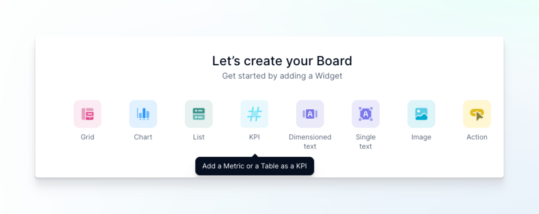
|
| You’re prompted with an option to select a Metric or a Table, then to select the exact view you want to use for the KPI. If no KPI compatible view exists, you can click Create KPI View and it will open the selected Block.
All views that are KPI compatible will be displayed in the "Select a View" dropdown. | 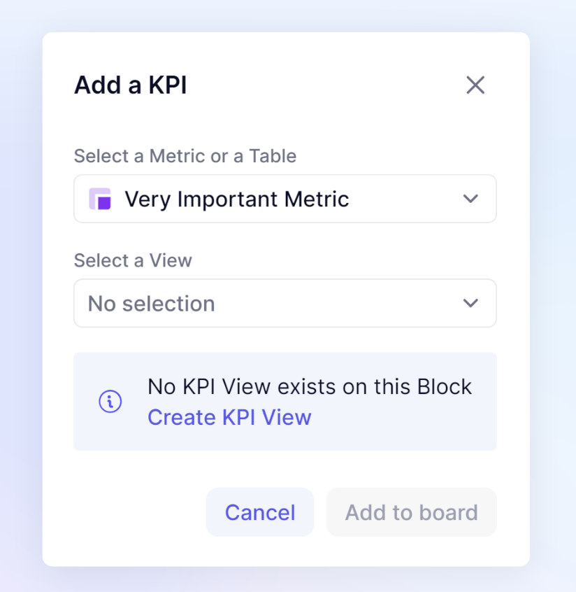
|
What do you do if you encounter an error when switching to a KPI?
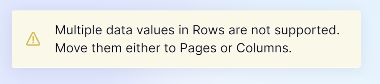
If you select the KPI view display mode but your View isn’t compatible, the following error message displays:
Multiple data values in Rows are not supported. Move them either to Pages or Columns.
To make your View compatible with the KPI visualization, you need to move all Dimensions that are causing the multiple rows to either Columns or Pages. You can do this by clicking Pivot, and then in the Configure Data panel rearrange your Dimensions.
WARNING: if you’re adjusting a View to be compatible to display as a KPI, be aware that your selected View might also be associated with a Grid or Chart View.
To avoid breaking the current grid or chart we recommend that you create a new dedicated KPI View by using the Save as functionality.
Adding a description to a KPI
After you create a KPI View, you can add a description by clicking Format. Here you can add a small description (limited to 70 characters) that displays below the KPI figure. If you want to complement your KPI with larger descriptive text we suggest you add a Text widget next to the KPI directly on the Board.
| 
|
Adding formatting
| You can add formatting to a KPI by clicking the menu (…) when hovering over a KPI. This formatting is also applied to cells in the grid, so we recommend that you create a separate View. | 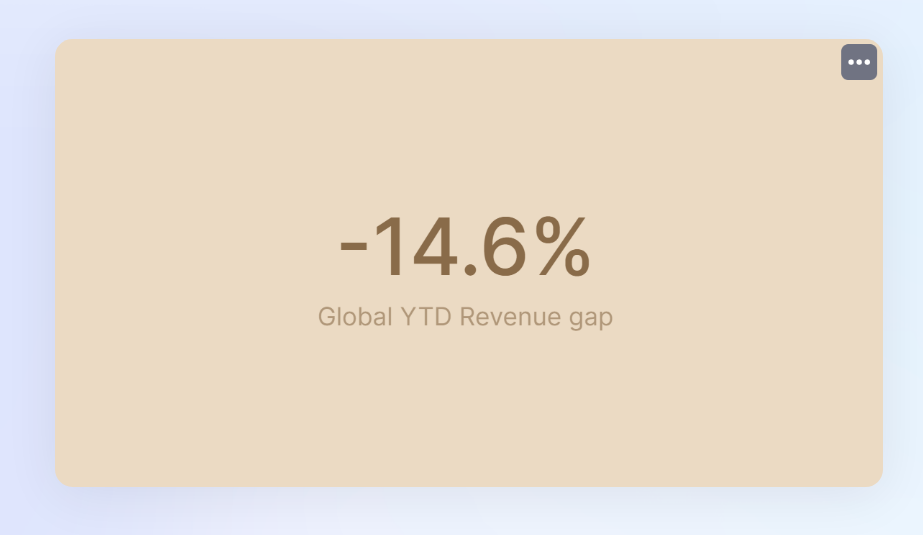
|
Note
Conditional formatting can be applied from the Grid display View and will remain when switching over to KPI display. For more information, see Apply Conditional Formatting to Highlight Data Changes.
Limitations
Only Total cells that are aggregated using a Sum are supported by the KPI View. You won't be able to create a KPI View when right-clicking on a Total cell that isn’t a Sum.