Solved

Adding comments in the margin of your P&L


Badge

Hello Pigment Community,

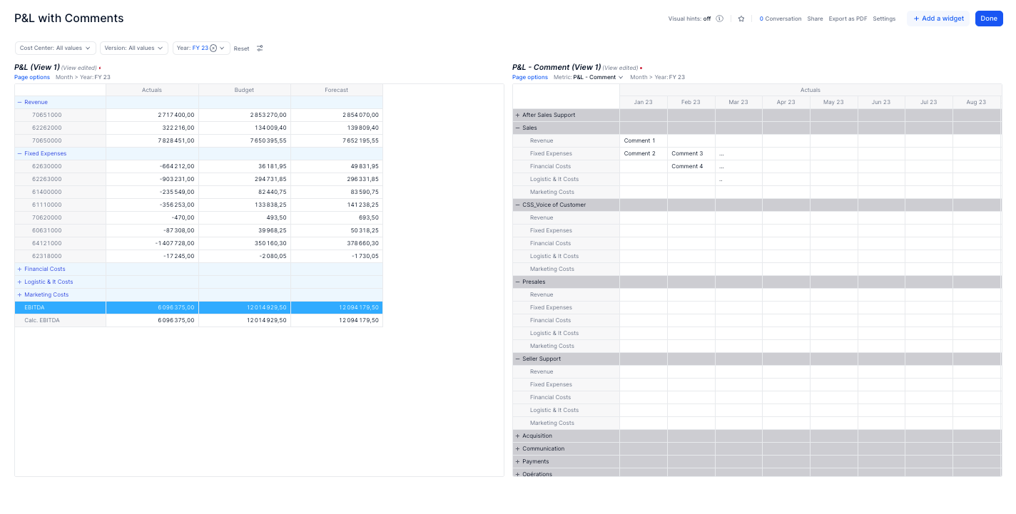
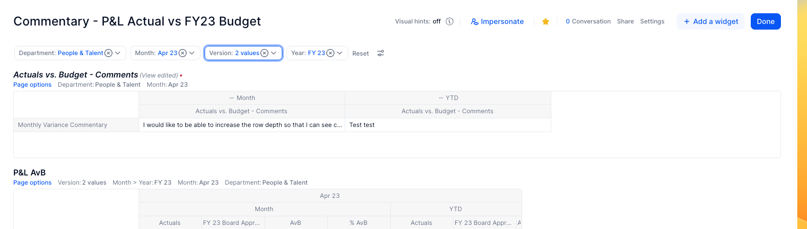
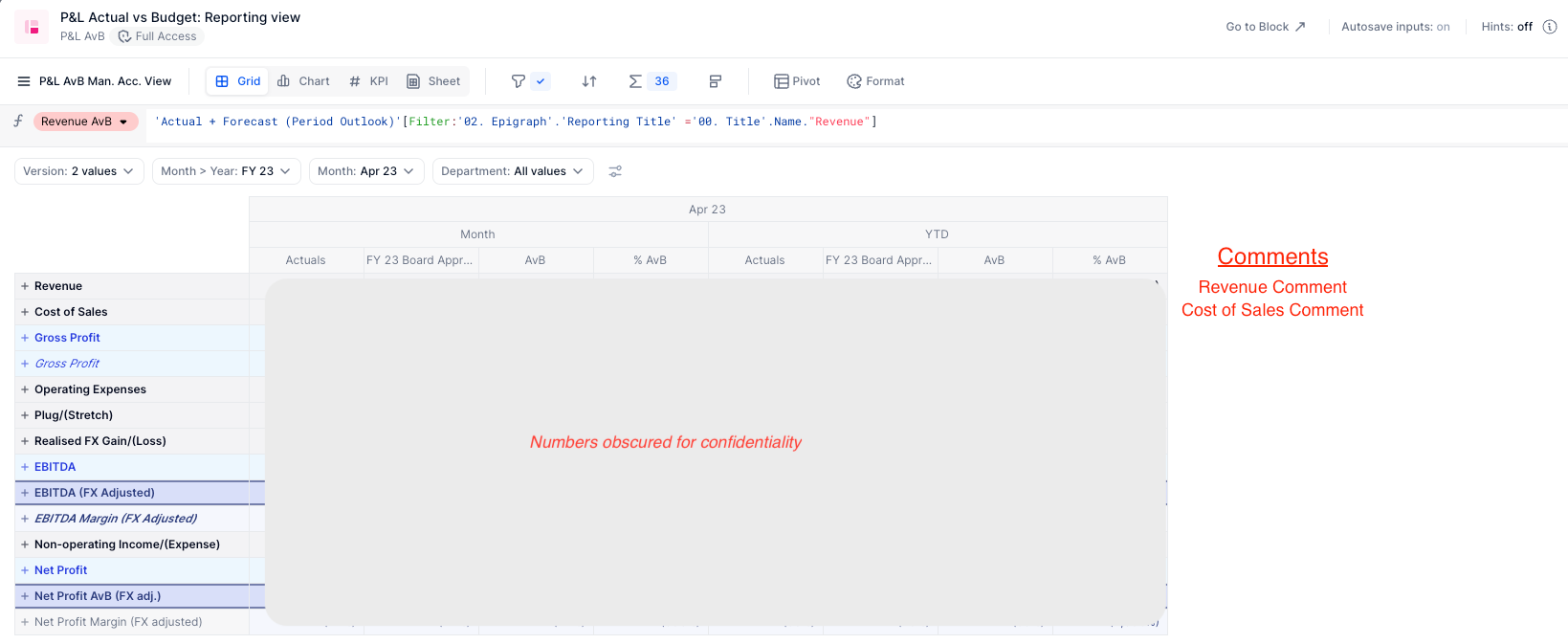
We have replicated our monthly reporting pack in Pigment, which was previously in Google Sheets. One key function (and final touch) that would make it identical to our files in Google Sheets would be the ability to add comments in the right hand margin for each income statement line of our variance analysis.

I’ve reviewed Pigment’s commenting functionality, which works well, but is not suitable for our use in this instance. We’re really set on having the comments visible, and being able to archive them. 

Here’s our specific requirements:

  • Be able to archive comments by period, version (actuals vs. forecast, actuals vs. budget, etc.), and by income statement line. 
    • For example: Imagine I am reviewing the May 2023 Actuals vs. Budget Income Statement variances. I comment to the right of the Revenue line “Revenue underperformed due to X, Y, Z. If in a year’s time, I filter on the month of May, for the May 2023 Actuals vs. Budget Income Statement, I’d like to be able to preserve the commentary.

I’ve included some screenshots which give you an example of our current report, and how I’d like it to look (in red).

Has anyone built something like this before? Does anyone have any ideas on how I could achieve this?

Thanks,

Gab


Current P&L with desired margin comments


icon

Best answer by Fabien 13 June 2023, 12:52

View original

11 replies

Userlevel 6
Badge +11

hey Gab,


it very much depend on how you did your p&L. In your case, metrics are in rows, which is my favorite approach (allows you to have different level of details depending of the nature/business).
However it means you can’t simply add a column to the right.

few things you can do:

  • Add comment metrics: your comments would be by row instead of in columns, which is not usual, but would follow the version structure and variations of your p&L
  • add a widget to the right, dimension by Version x Time x Department and the level of comment you want (detailed account or high level (revenue, cog). it won’t be aligned to the rows, but you can use high as big blocks of text that explain a lot. That’s my favorite: Change of habits but better result. Do you really need line by line repeating the numbers or a great explanation of business reason for a scope ?
  • you can create a dimension that mimics you metrics in rows then create a metric with that as a dimension and put that widget to the right, which would be aligned to your rows. That’s  a bit hacky, it can work but I don’t recommend it.
Badge

Hi @Nathan , thanks for the response. Great to see the range of options available in Pigment.

I’m curious to learn more about the logistics of how we’d go about setting up options 2 and 3 in practice. Step-by-step instructions (high-level), would be much appreciated. Happy to provide any more context as to how our P&L is set up if that would help.

  • Option 1 - interesting, but unlikely we’ll want to adopt.
  • Option 2 - this could potentially work for us, but I’d need to see how it looks and works. Line by line would be ideal for us, but really, we will likely only comment on sort of mid-level of details. I.e. Revenue stream 1 - comment, revenue stream 2 - comment. COGS line 1 - comment, COGS line 2 - comment, etc.
  • Option 3 - Sounds like exactly what we need. If you could explain a bit more how to set it up, and why you don’t necessarily recommend it, that would be great. Line-by-line commenting is very important to us, so I’d be inclined to at least try and set this up.

Thanks,

Gab

Badge

Hi @Nathan - having thought about this a bit more, I think we’d be comfortable adopting Option 2. By this I mean having a “linked text box” with high-level comments for each statement. For example, having comment(s) for April 2023 Actuals vs. Budget - Sales Dept. And being able to archive the comment for that exact report and pull them up when you filter for that statement.

Would you be able to provide some instructions on how to add a widget to the right that connects Version x Time x Department?

Thanks,

Gab

Userlevel 3
Badge

Hello Gab,

I built a quick mockup to illustrate Nathan’s proposal (in the following mockup, you can replace Cost Center by Department):
 

  1. You need to create a Text Metric, structured by the dimensions you want to input and store your comments (Category, Month, Version, Department).
    Note that Department = Cost Center in this Mockup.
    If you don’t want to comment at the Category level, but just for a Board (ex: Actuals vs Budget), you can exclude the Category of the structure. Then name your metric something like Actuals vs Budget - Comment
    Make sure to toggle on the Allow overriding formula results with an input option from your metric’s settings menu.
     
  2. From the Pivot panel, you can decide how your table will look like : whether you want to display the Department directly in the table (as in the mockup), or only select it from the Page Dimension selection of the Board (attention: you would then only be able to comment if there is a single Department selected. Otherwise any cell of your metric would be an aggregation of multiple Department, preventing from inputting any text value).


I hope it helps.
Thanks
Fabien​​​​​​​

Badge

Thanks @Fabien - I’ve taken some of the fundamentals you’ve suggested and created the below board. Now when I filter for a certain month I will have an archive of the MTD and YTD commentary, and it will also pull up the relevant monthly AvB PnL table.

That being said, is there a way you can suggest to create bigger “text boxes”? This commentary will often be a paragraph, and as it stands, it it is getting cut off. 

Any presentation / formatting changes you can suggest to make my commentary more readable?

Thanks!

Gab


Userlevel 6
Badge +11

I was a bit ahead of things by saying text boxes, which we can’t do right now. 

It’s a feature idea that you can vote for to make it happen earlier !

Badge

@Nathan @Fabien 

So at this stage is there anything you can suggest to improve the formatting of my comments? That’s a bit disappointing as you made it sound like it was possible.

There’s no way to change the formatting/structure of cells to make my text more readable? Expand them, etc.?

You both suggested technical solutions that make sense, but did you have any suggestions on the presentation aspect of things?

Thanks,

Gab

Userlevel 3
Badge

Hello @gabmactavish,
Unfortunately, this is actually the only way to input text comments with a specific dimensional structure.
And true, it doesn’t offer (yet) the ability to change the structure format of the text.
As mentioned by Nathan, that could be a feature request you can vote for.

It is also possible to insert texts on a board using the Text widget (and this allows formatting your text properly), but you can’t dimension it.

In the meantime, it is still possible to format your comments using bold, italic, but that applies to the entire cell and not to subpart of the comment.

Just out of interest here @Nathan @Fabien - what are other businesses doing for commentary? Seems a pretty easy ask yet we can’t even expand the display of our comments? 


Userlevel 3
Badge

Hi @Sophie,

It is either Comment are not multi-dimensionnal and Pigment provides the usual Comment widget feature (available from the Board edition). It acts as a widget of the Board.


Or Comments need to be used in a dimensional structure (this current use case) and at the moment Pigment does not allow formatting the text within a Text Cell of a Metric.
That would still be a very fair enhancement request.

Userlevel 6
Badge +11

Just out of interest here @Nathan @Fabien - what are other businesses doing for commentary? Seems a pretty easy ask yet we can’t even expand the display of our comments? 


 Hey Sophie. They are indeed using in metric comments, increasing the length of the column. There is text wrap when the mouse over the cell

Reply