Solved

Dynamically Aggregate items in Chart views

  • 5 February 2024
  • 2 replies
  • 152 views

Userlevel 3
Badge +8

 Hi Pigment friends,


I wonder if there is a way to dynamically aggregate calculated values when using multiple items in a dimension? I am sure my question is confusing, so hence, I will give an example.

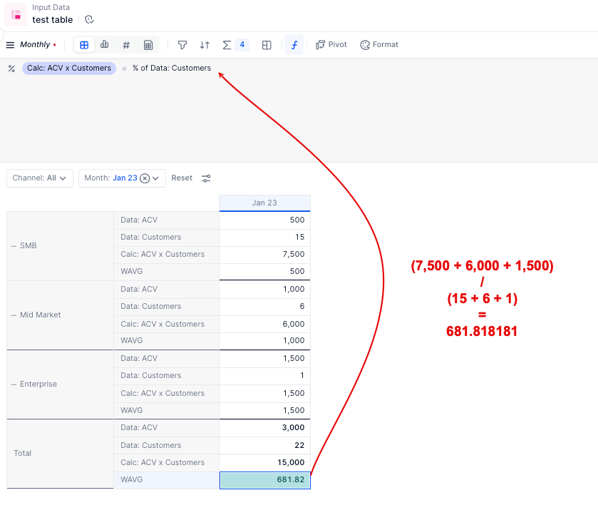
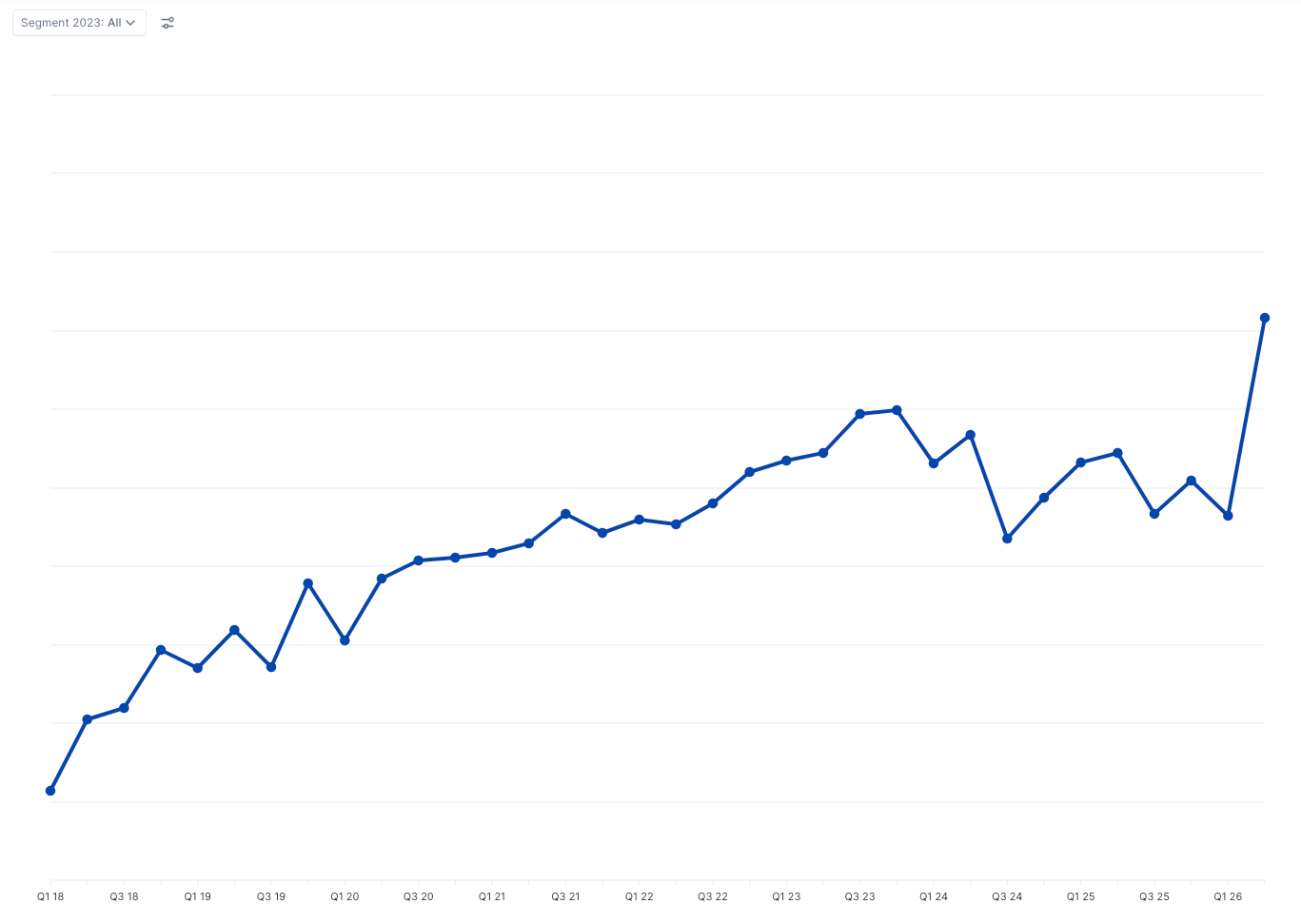
We are presenting Average Contract Value (ACV) in each segment throughout the year on a monthly basis (we have 3 segments):

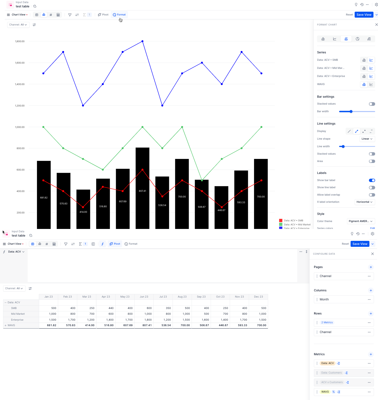
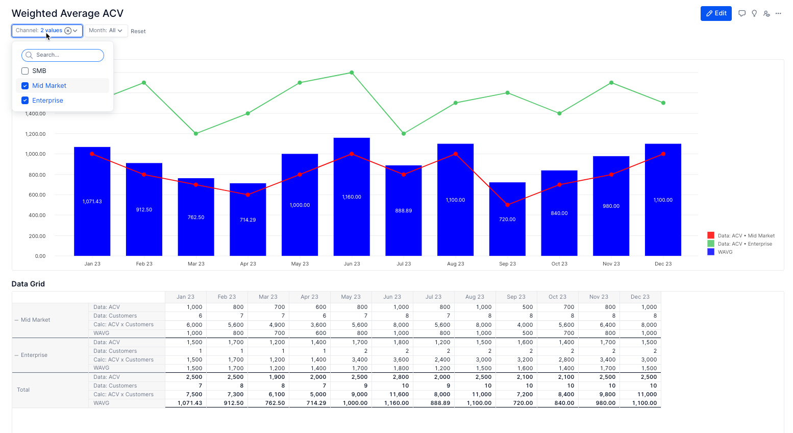
Each node in the chart is the ACV and all segments are currently selected. The thing is, when we want to represent aggregated ACV with all segments, we need to create a separate chart:
 

The downside of this chart is that we cannot dynamically add/combine/remove segments, because it will start summing them up, instead of showing ACV of combined segments. For instance, if I select Small customers ACV ($500) and Medium customers ACV ($1000), and we have 10 small customers and 5 medium customers, the average aggregated ACV should be: (10 * $500 + 5 * $1000) / (10 + 5) = $667. With aggregated chart, it will sum $500 and $1000 and show $1500 as total ACV, if Small and Medium segments are ticked in the Filter on top of the page.

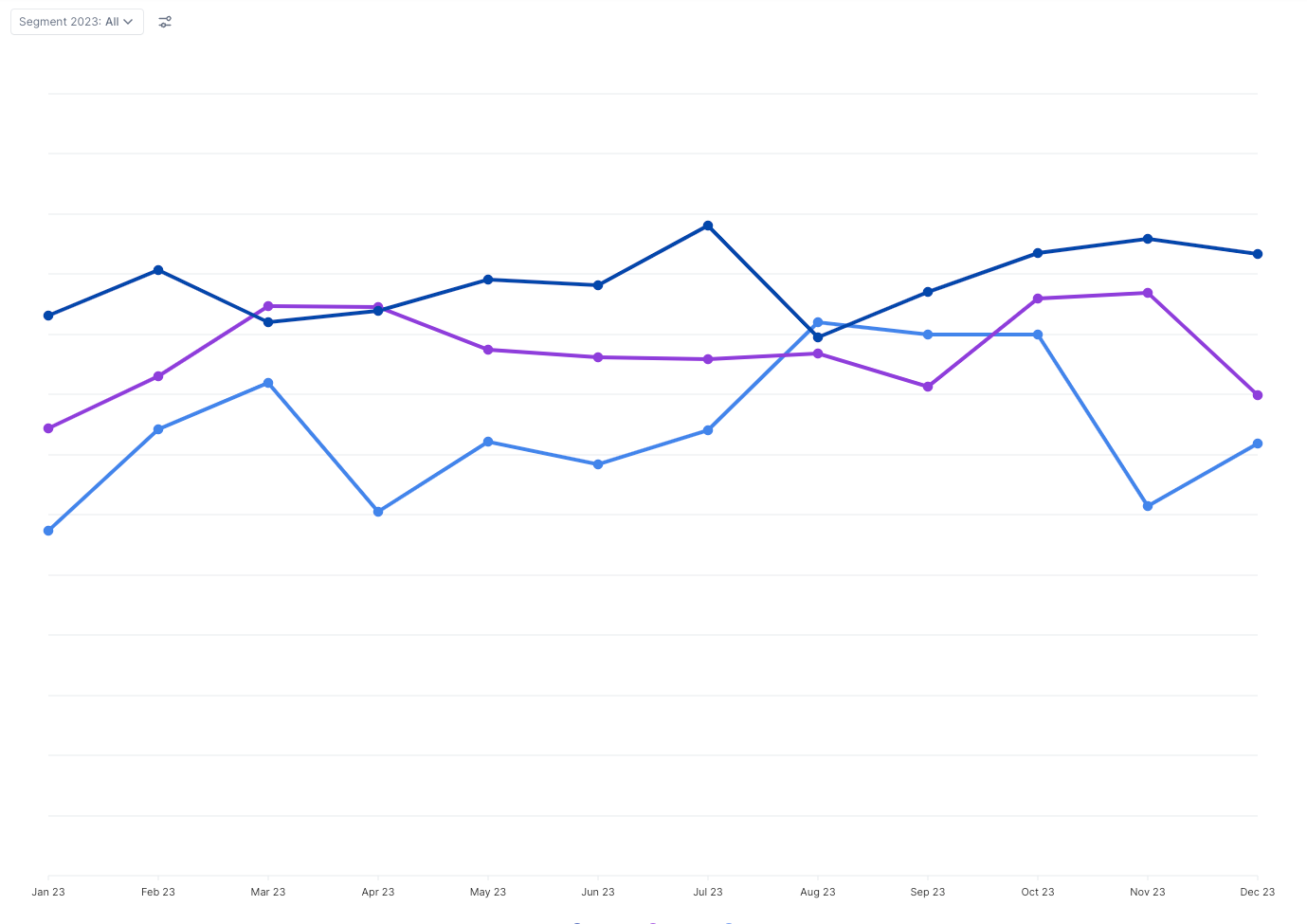
I was able to set up an alternative filtering using dimensions select/unselect in the data source, but it is slow and is probably not technically viable:


icon

Best answer by Jake 6 February 2024, 00:09

View original

2 replies

Userlevel 3
Badge +4

Hi Dastan,


If you use metrics to store your ACV and Customer values, you can use the “Show Value As...” feature with some clever pivoting to achieve the ACV values for all segments as well as the weighted average ACV value by segment.


This community article goes over how to leverage “Show Value As...” to properly calculate ratios and averages at summary levels.


In the example below, I have a simple table with 4 metrics:

Data: ACV = input metric with Channel (use Segment in your modeling) and Month in the block structure

Data: Customers = input metric with Channel and Month in the block structure

Calc: ACV x Customers = calculation metric that multiples the two metrics above

WAVG = Using the “Show Value As...” feature, I added the Calc: ACV x Customers metric to the table again, and am showing the value as a percent of the metric Data: Customers.


The WAVG line takes the sum of the channels before running the ratio calculation, not after 

From there, I set up a grid view with all months as well as a chart view where I hid the Data: Customers & Calc: ACV x Customers metrics, pivoted the Channel dimension to be both in rows and pages, leveraged tree view in the layout page, and expanded Data: ACV while keeping WAVG collapsed.

Chart pivot and series settings

You can see in the screenshot below, when selecting different channels, the grid and chart update as well as the WAVG calculation.


I hope this helps!

Userlevel 3
Badge +8

Hi Jake, thank you. Yes, I understood the approach, will try to execute it.

Reply