


The Org Chart displays hierarchical relationship between items. The main use case for an Org Chart is to visualize the structure of an organization. This article discusses how to create a Table for the Org Chart and how to configure the chart.
Table of Contents
Org Chart Resources:
Check out all of our Org Chart resources
Setting up a Table for an Org Chart
The Org Chart requires a Table and certain Metrics to be properly set up before configuring the Org Chart. When setting up your Table, you’ll need Metrics dedicated to the hierarchy and then there are some optional customization configurations. The customization configurations can be Metrics within the Table or properties within a List. Follow the process below for building your Table.
Define the primary data
The first step when building the structure of your Org Chart is to define your Primary data. Your Primary data is the lowest level of granularity you want to represent in your chart. In the traditional example of an Org Chart, Employees or Seats would be the most lowest level. To create an Org chart, the Primary data must be represented in a Dimension List.
Define the hierarchy of the Org Chart
After establishing the Primary data, the next step is defining the Hierarchy that the Org Chart will represent. Hierarchies can be defined by establishing a Reporting hierarchy and or by creating Groups.
A Reporting hierarchy is when the different levels of the hierarchy are represented by items from the same list as the Primary Data. For example, in a traditional Org Chart, Employees report to other Employees. There can be only one reporting hierarchy per chart.
A Group is a level of the hierarchy represented by items from a different list than the Primary Data. For example, in a traditional Org Chart, Employees belong to Departments, therefore you would use a Department list to configure Groups. You can create multiple Groups within an Org chart.
When creating an Org Chart, you must have at least one Reporting relationship or Group. You can also create a combination of the two types hierarchies and include multiple Groups.
When creating multiple Groups within an Org Chart, the dimensions used must have a defined hierarchical relationship. For example, Countries and Regions have a hierarchy while Country and Department are independent.
Building the Table for the Org Chart
Reporting hierarchies and Groups are created through Metrics within a Table.
These Metrics must be dimensionalized by the Primary data dimension, along with any additional dimensions you might want to showcase change within the Hierarchy.
For example, if you were to create an Org Chart that showed Employees across multiple months, you would dimensioned all of your Metrics by the Employees and Months lists.
These Metrics must be set to a Dimension Data type and contain the Dimension list that you want the Primary data to roll up into. If you are creating a Reporting Metric, you will set the data type to the same dimension as your Primary data. If you are creating a Group, you set your data type to the dimension you wish to Group by.
All the Metrics in the Table should be at least dimensionalized by the Primary Data dimension plus Time and/or Versions if you want Org Chart data to change over time and/or Version.
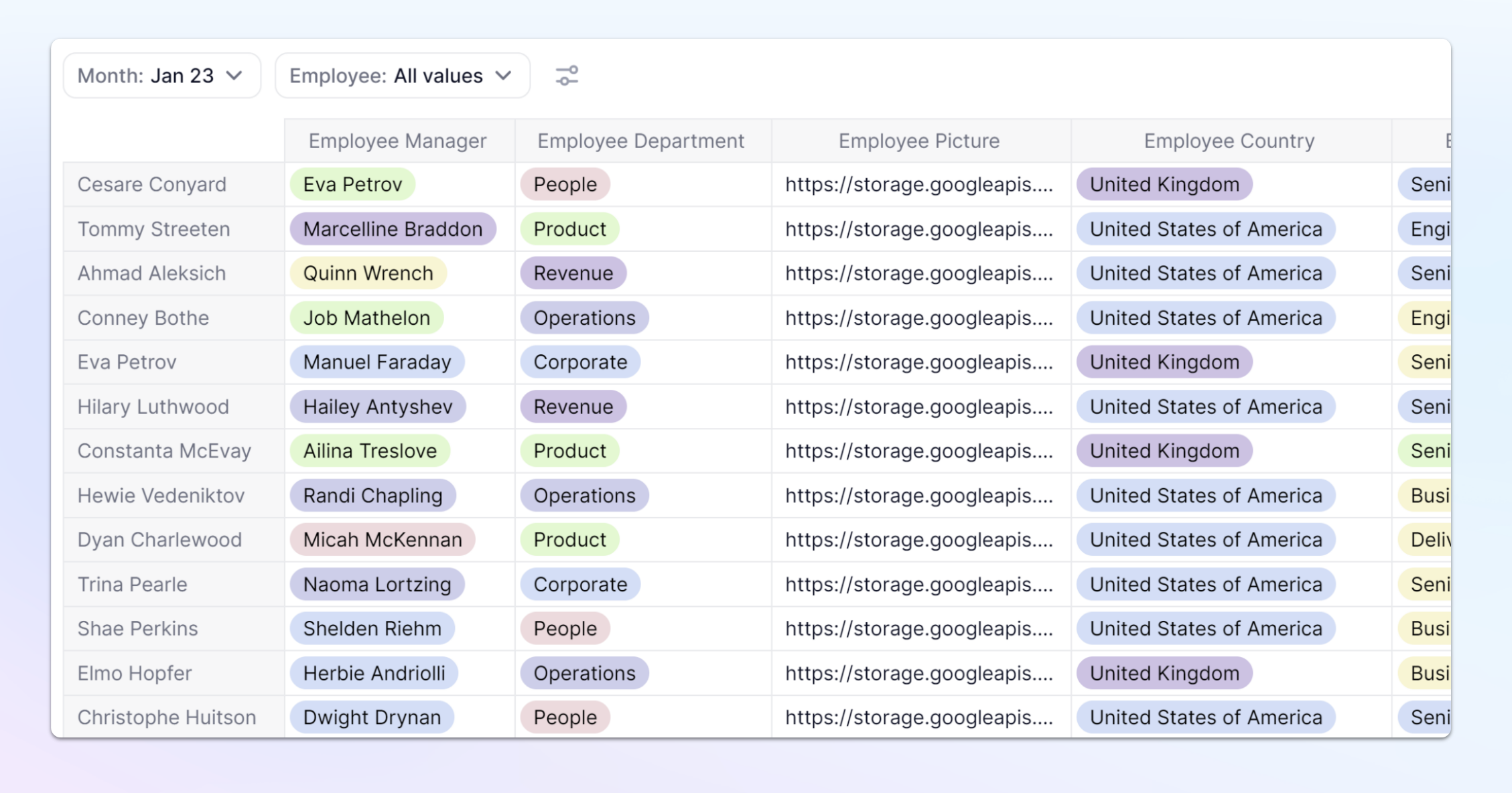
Here is an example Table for the structure of an Org Chart. Both of these Metrics are dimensioned by Employee and Month Lists.
Employee Manager is a Reporting Metric, it has the same dimension data type of Employee but each item is aligned to a different item creating the reporting hierarchy.
The Employee Department Metric is used to create Groups. It has a dimension data type of Department which is different than the Primary data type of Employee. This Metric is grouping the Employees by Department.
Optional customizations
Once you have established the structure of your hierarchy, you can use other Metrics or List properties to customize the cards that make up your chart. If you are using Metrics for these customizations, they must use the same Dimensions as the other Metrics in the Table. There are 4 different fields Title, Picture, Subtitles, and Color by. These fields can be populated by Metrics with the same structure as the Metrics you used to create your hierarchy or they can be List properties of the dimensions used as the Data type in those Metrics.
Title - This is the top field on the card that will be displayed with Bold text.
Images - Use a text Metric or Property that contains a URL to an image that comes from an approved domain. For more information on setting up an image, check out this article on displaying images.
Images are displayed in the Org Chart at size of 56px x 56px but we recommend a minimum size of 112px per width or height.
Subtitles - Complementary information that will display below the Title. You can add up to 3 different subtitles to a Card.
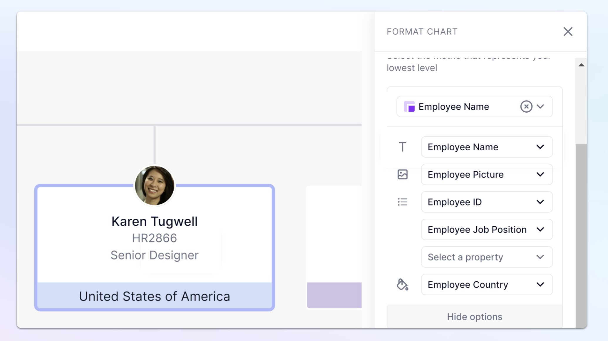
Color by - This field defines the color on lower part of the card. The field will showcase the name of the List property or Metric and will assign colors to items.
In the example below, Employee Country is used and the United States of America is displayed as blue. All other employees from the United States of America will also be blue all other values will have a different color.
At this time, the color that represents each item is randomly assigned.
Configuring the Org Chart
This section explains how to configure a chart once you have created a Table following the steps above to complete a Table with the required Metrics.
Step 1. Set up your Pivot
There are certain rules that must be followed when setting up your Pivot for the Org Chart.
- Rows must contain the Primary data dimension(s). This dimension is the dimension used for your Primary data.
- Only the Metrics used in creating the Reporting hierarchy, Groups, and optional customization can be displayed in columns,. If you add an additional dimension in Columns the Org Chart won’t display.
- When using additional dimensions for your Metrics, these must be placed only in the Pages section. For example, if your are using a month dimension along with your primary data, you would set Months as a Page selector.
When using additional dimensions that are set as Page selectors, set them to be Single Page Selectors to avoid end users selecting multiple items the chart can’t render.
Step 2. Set up the Chart
- Select the display type of Chart on your Table and click on the Org Chart icon.
- Set your Primary Data, by using the Dimension that you set on Rows.
- Use the Customize display button to assign the Metrics or List Properties to the different fields. Your options will include Metrics from the Table as well as List Properties from the Primary Data dimension.
- Assign your Reporting and/or Group Metrics. If your Metric uses the same dimension as your Primary data as the data type, it is the Reporting, if you use a different dimension as the data type, use the Groups. Add any additional Groups and the level they should appear in.
- If using a Group, you can also Customize the display. Along with Metrics from the Table, you’ll also get the option of List Properties from the dimension used in the Group.
- Within your Groups or Primary data, you can click on the Customize display button to add any Action buttons.
- Once finished adjusting, click Save.
You can have both reporting and group Metrics. The reporting Metric will always be the level directly above the Primary data.
List properties of data type Dimension are not supported so you need to model them with a Metric.
Additional Display options
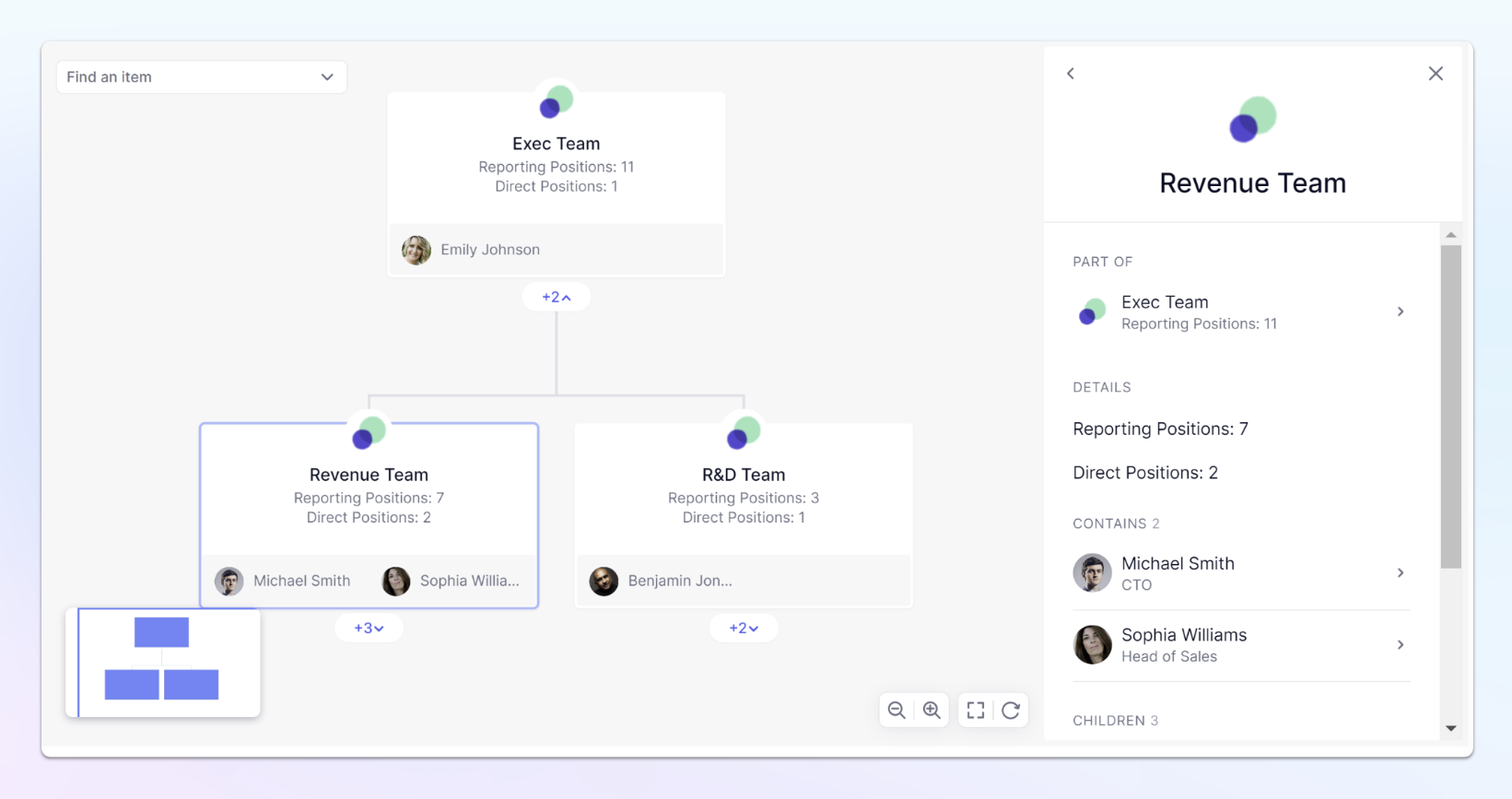
When working with Groups, the display primary data inside groups functionally allows you to position your primary data directly within the cards. When the card is open on the sidebar, all items from the primary data will appear under the Contains title.
In this example, you can see two Primary items, Micheal Smith and Sophia Williams are contained within the Revenue team group card.