


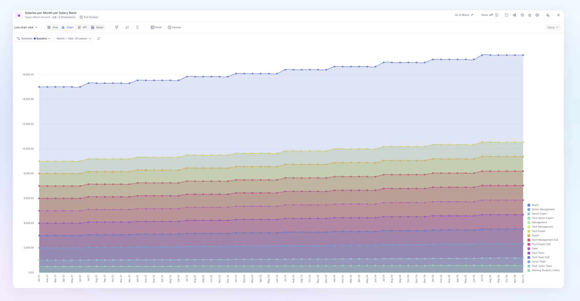
Line charts are useful for showing trends in data across multiple groups over the same period of time. This article will discuss the line chart-specifications.
When preparing for creating a chart, the way you establish your view has a big impact on the result. Review the following articles to help customize your view before customizing options.
Use the Pivot functionality to change the axis and add/remove dimensions
Use the Filter feature to remove items from a list.
Use the Sort functionality to change the order of items in the chart.
Here are the specifics of Line chart options
Setting | Description | Options |
| Display | The Display setting configures the type of line that is used. | Line: Displays line that runs through the data points
Line with dots: Displays line connecting dots on the data points
Dots: Displays dots on each data point with no line connecting |
| Line Shape | The Line Shape setting configures the shape of the curve which connect or interpolate the series data points. | Linear: Displays straight line segments connecting points
Natural: Displays smooth curve connecting points
Basis: Displays smooth curve interpolating points |
| Line width | The Line width setting configures the width of the line.
| Slider from 0 to 10 (2 by default, use 0 to hide the curve) |
| Dashed Lines | If lines are enabled in the Display setting, the Dashed Lines setting controls is a line is solid or dashed. | Toggle on/off (off by default) |
| Y stacked values | The Y stacked values setting configures the position of each series. If the Y Staked Value option is enabled, Series values are added on the Y-axis, so each consecutive series appears above the last with their value added to the previous number. Make sure the units of all series match to ensure the desired result | Toggle on/off (off by default) |
| Area | The Area setting fills the area under each curve. | Toggle on/off (off by default) |
| Area opacity | The Area opacity setting controls how transparent or solid the area is under the lines. | Slider from 0.5 to 1 (.2 by default, 1 is a solid area) |
| Point labels | The Point labels option toggles the appearance of value labels for each data point on a chart. | Toggle on/off (off by default) |
| Allow Label overlap | The Bar Label setting shows/hides the label on each data point displaying the value of the point. This feature ensures labels are present even if the data points are too close together. | Toggle on/off (on by default) |
| X label orientation | The X label orientation setting configures the orientation of the X-axis labels. | Horizontal, vertical or diagonal To avoid label overlap, use the diagonal or vertical option. |
| Color Theme | The Color Theme option configures different presets of colors to represent each series. | Outside of your Workspace color Palette. Pigment support 9 presets; Pigment, Rainbow Spectrum, Copenhagen Facades, Sunset Boulevard, Winter Wonderland, Utility, Moreno Glacier, Autumn in New York, Summer sky. |
| Series colors | Select the individual colors for items within a Series. | Assign each item its own individual color. Pigment remembers the order of your selection if you switch through different Color themes. For example, if you assign an item the first color in a palette, it will remain the first color regardless of which theme you select. |
| Show X gridline Show Y gridline | The Show gridline options will allow you toggle on and off the gridlines that are shown in the background of the chart. | Toggle on/off (on by default for Y and off for X) |
| Hide Y axis | The Hide Y axis option removed the Y axis from view. | Toggle on/off (on by default) |
| Y Scale | The Y Scale option allows you to choose how the length and values on the Y Axis. There is an Auto and Fixed option. | Fixed allows you manually define the Min and Max values on the Y Axis. Auto will automatically define the scale based on the min and max value of items in the series. |
| Include 0 | When Y Scale is set to Auto The Include 0 setting will ensure that there is a 0 featured in the Y axis. | Outside of your Workspace color Palette. Pigment support 9 presets; Pigment, Rainbow Spectrum, Copenhagen Facades, Sunset Boulevard, Winter Wonderland, Utility, Moreno Glacier, Autumn in New York, Summer sky. |
| Show legend | The Show legend setting shows/hides the Legend of the chart series. Use this option to display or hide the legend. | Toggle on/off (on by default) |
| Legend Position | The Legend Position setting configures the position of the legend. | The legend can be set to 4 different positions: Bottom right, Top right, Bottom center, Top center. (Bottom right by default) |